CLIENT

Checkers & Rally's

SERVICES

Rebrand, Logo Design

DETAILS

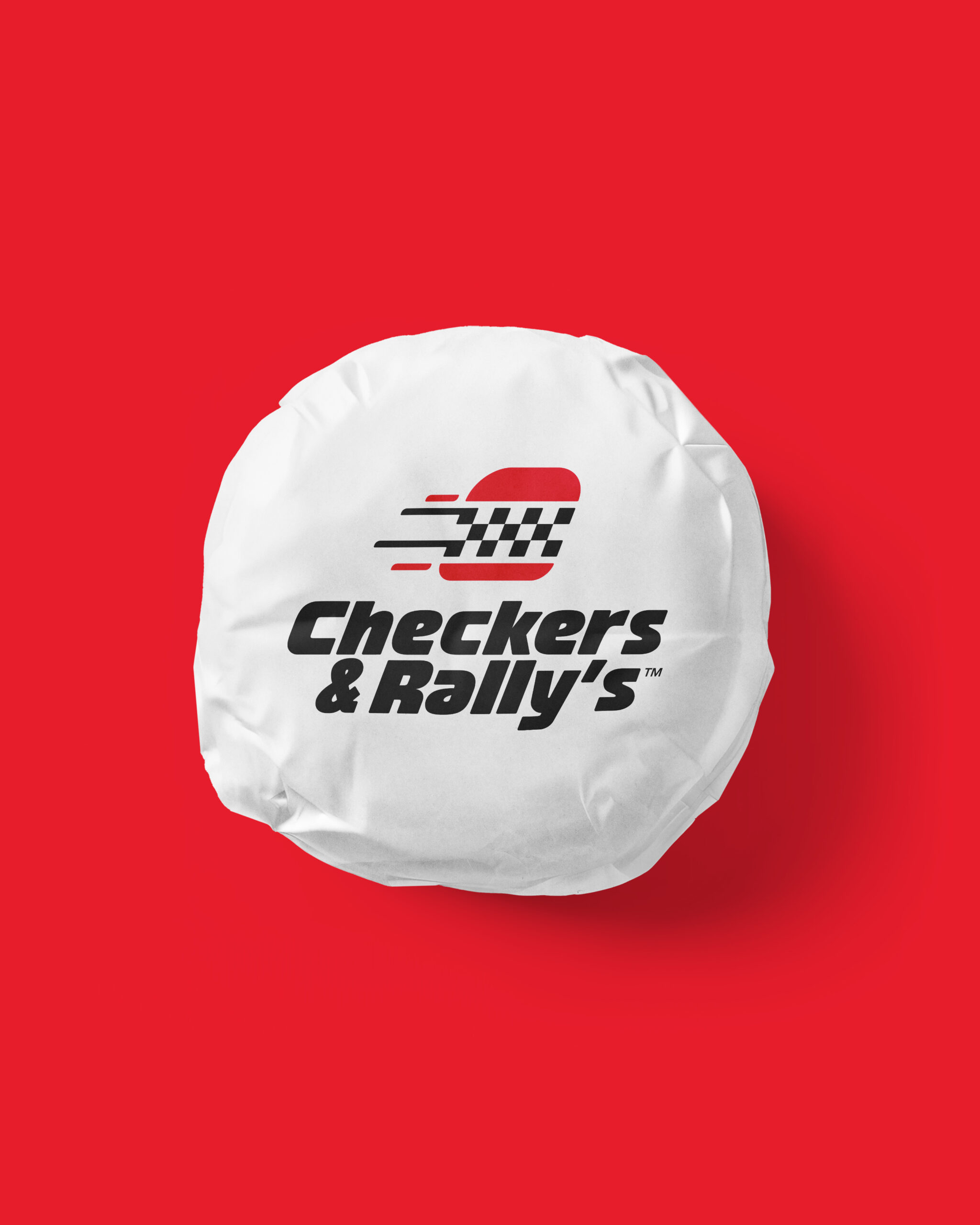
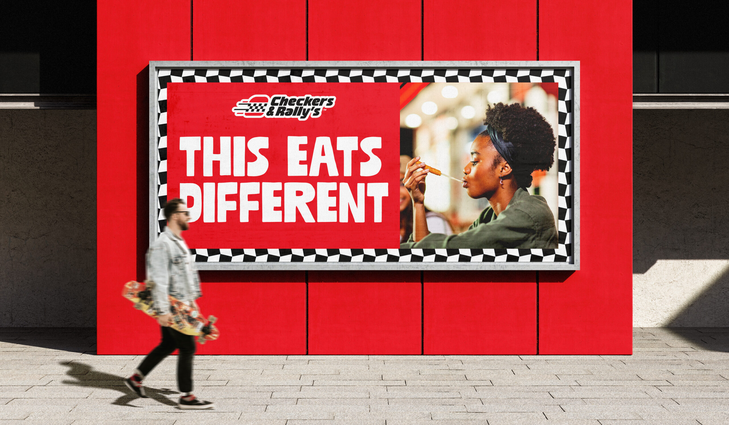
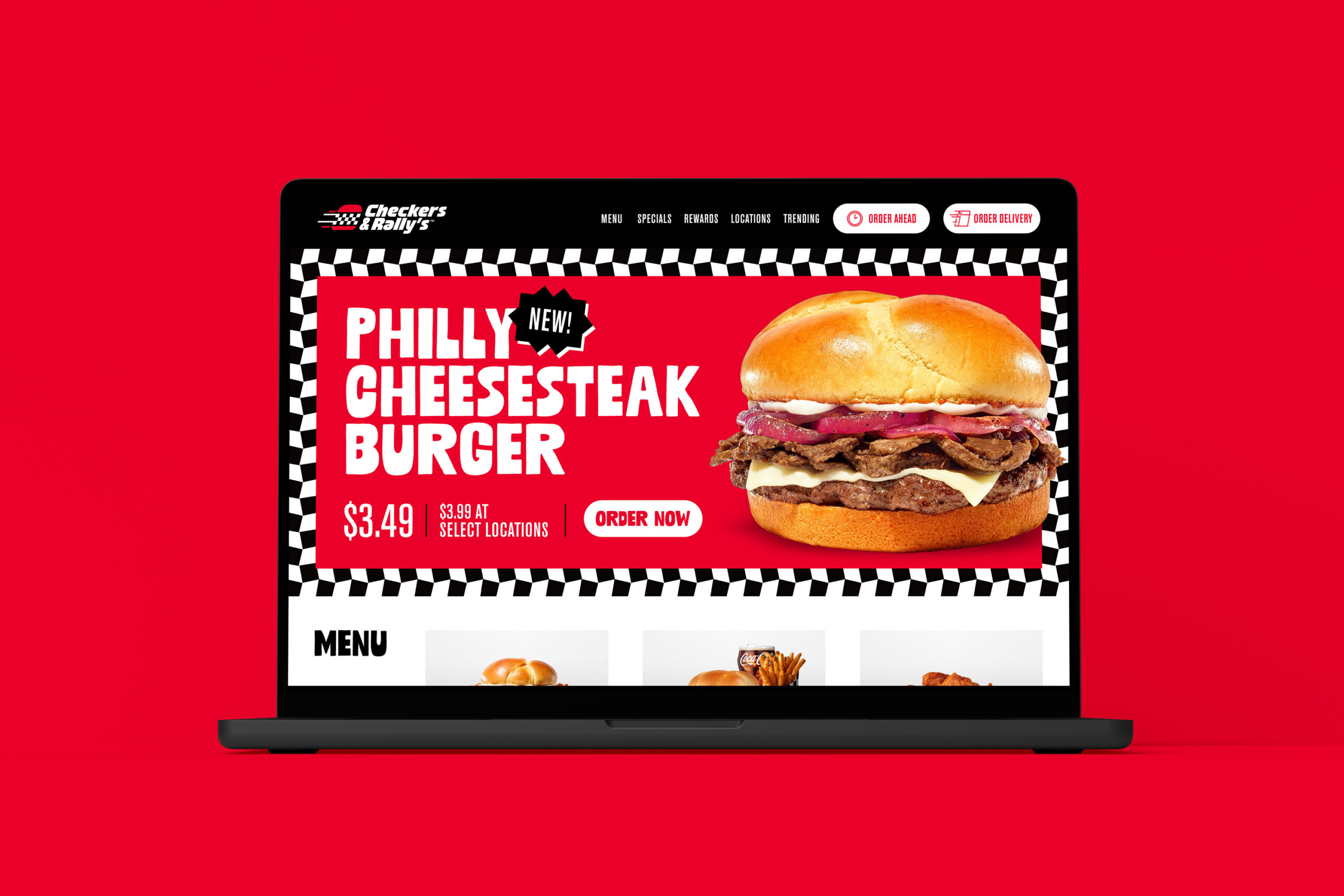
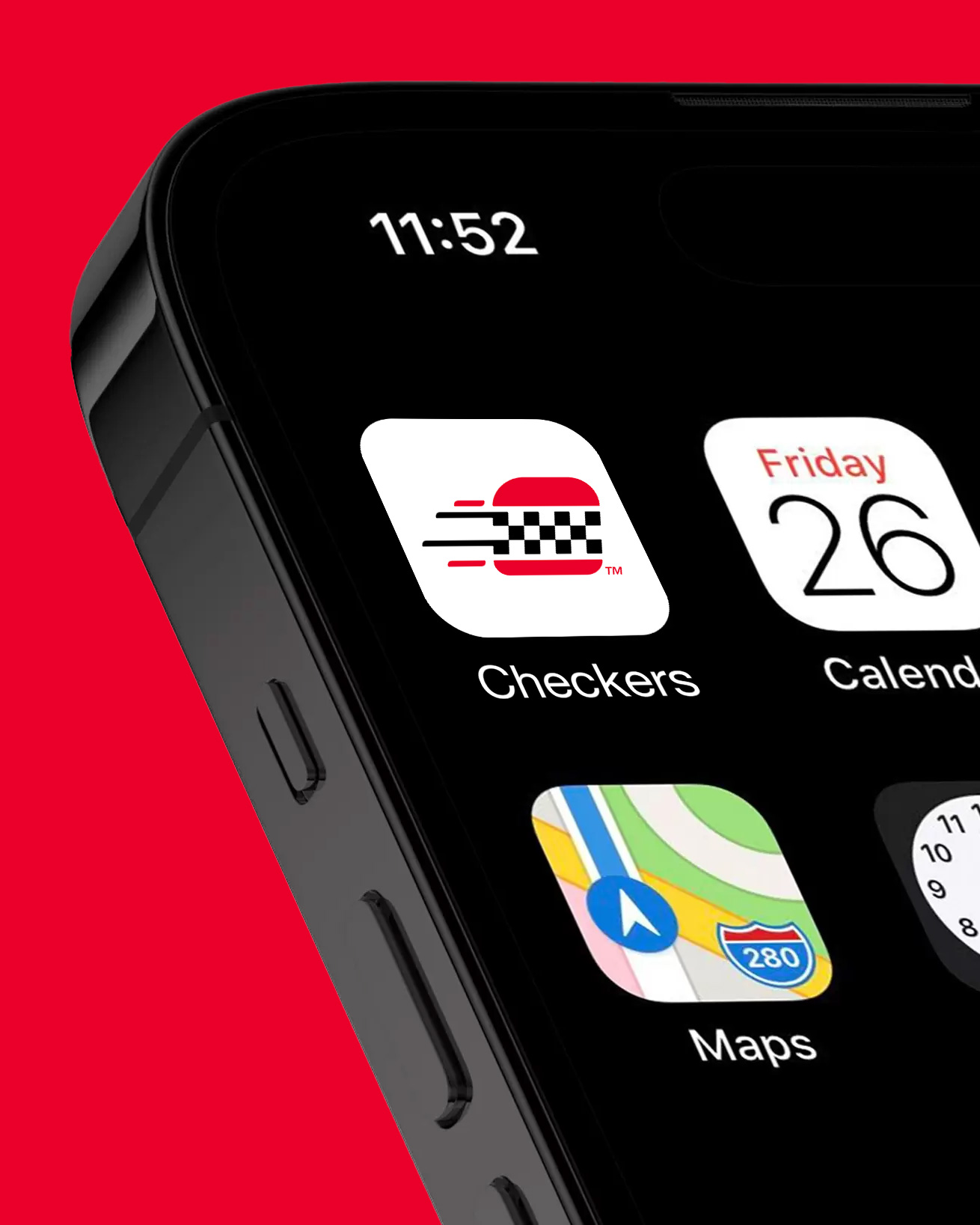
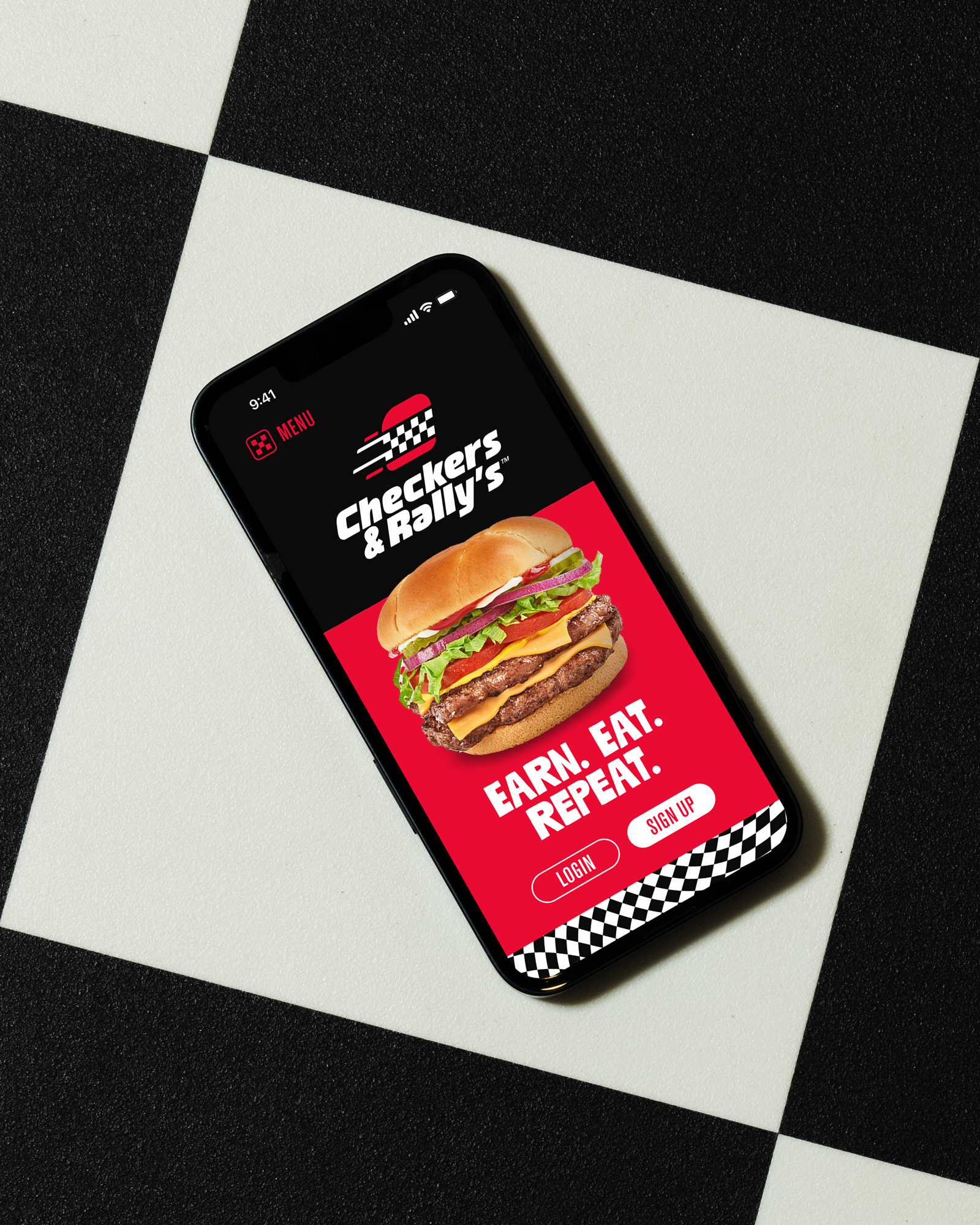
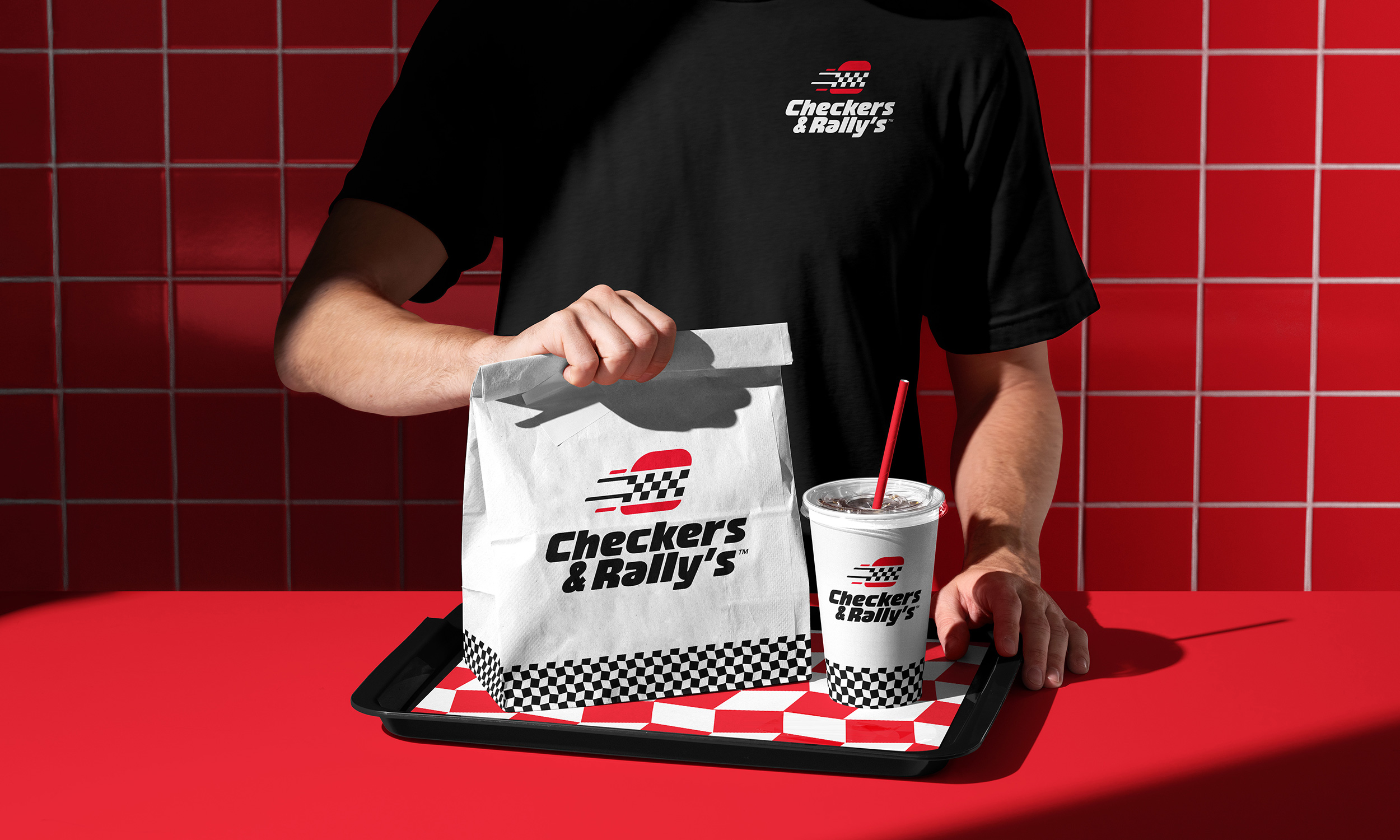
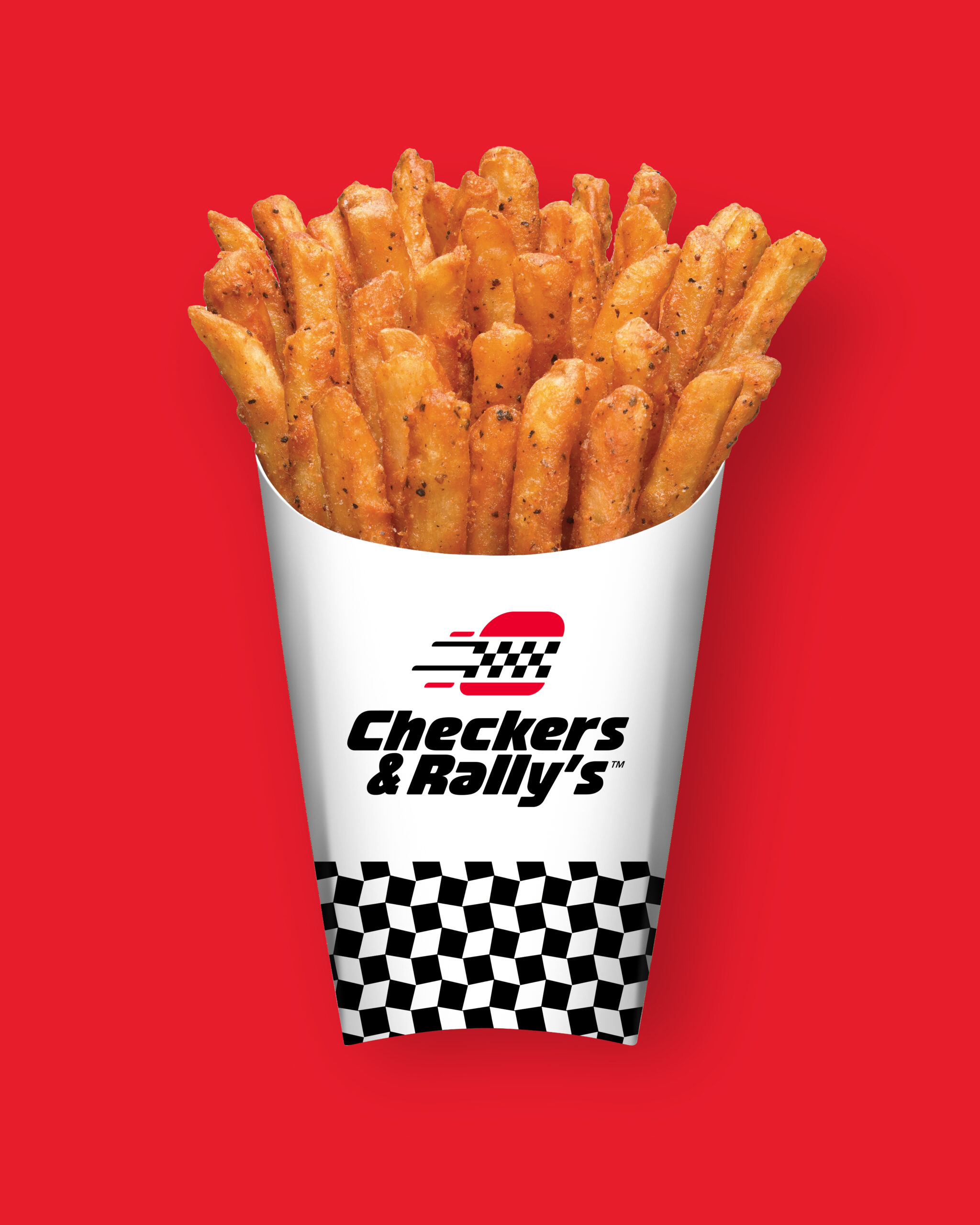
Stronghold was hired by Partners + Napier to work on a rebrand for regional fast food chain Checkers and Rally's. This was a unique project because Checkers and Rally's are separate entities that look the same and offer the same menu, but are located in different regions. Because of this, the logo had to work in three formats—Checkers, Rally's and Checkers & Rally's. After working through many iterations, we landed on a speeding burger icon paired with customized typography in a wide variety of lockups. A robust brand guide and applications were also developed.
Stronghold Studio Checkers & Rally’s
CR_Fries1
CR_Burger
CR_Billbord
CR_Website
CR_Phone1
CR_Phone2
SERVICES

Brand Identity
Packaging Design
Print Design
Illustration
Naming & Strategy
Art Direction
Website Design

MISSION

Through a process that puts an equal emphasis on understanding a clients needs and creative solutions, Stronghold's goal is to create memorable and meaningful brand experiences when working with clients big and small.

Stronghold_Logo_Transition_WhiteStronghold_Logo_Transition_WhiteStronghold_Logo_Transition_WhiteStronghold_Logo_Transition_WhiteStronghold_Logo_Transition_WhiteStronghold_Logo_Transition_WhiteStronghold_Logo_Transition_WhiteStronghold_Logo_Transition_WhiteStronghold_Logo_Transition_WhiteStronghold_Logo_Transition_White
View