CLIENT
Chiavetta's
SERVICES
Logo Design, Packaging, Branding
(Self-Initiated Project)
DETAILS
Buffalo Food Rebrand Series
In 2025 I began a six-part personal design series to reimagine iconic Buffalo food brands through a modern lens. The goal was to refine each brand’s visual identity, streamline its branding and packaging, and preserve the equity and character that made each one a Buffalo staple. This is an independent passion project, not commissioned work by any of the featured brands. It is simply my way of combining my love of Buffalo, food, and graphic design.
Part 1: Chiavetta’s
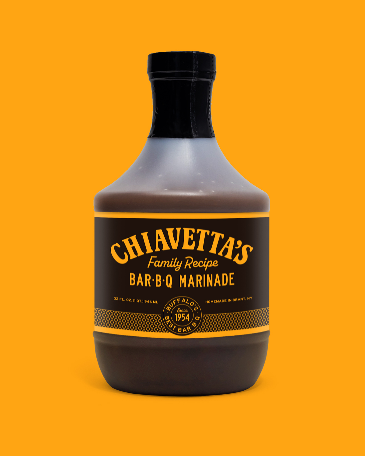
Chiavetta’s is known for its legendary marinade and, in my opinion, some of the best chips on the planet. I focused on reimagining the brand’s packaging and visual identity while staying true to its established character. The redesigned marinade bottle combines Chiavetta’s signature yellow with dark brown and vintage-inspired typography for a look that feels both classic and elevated. A diamond-shaped pattern references the grills used at their famous pop-up events.
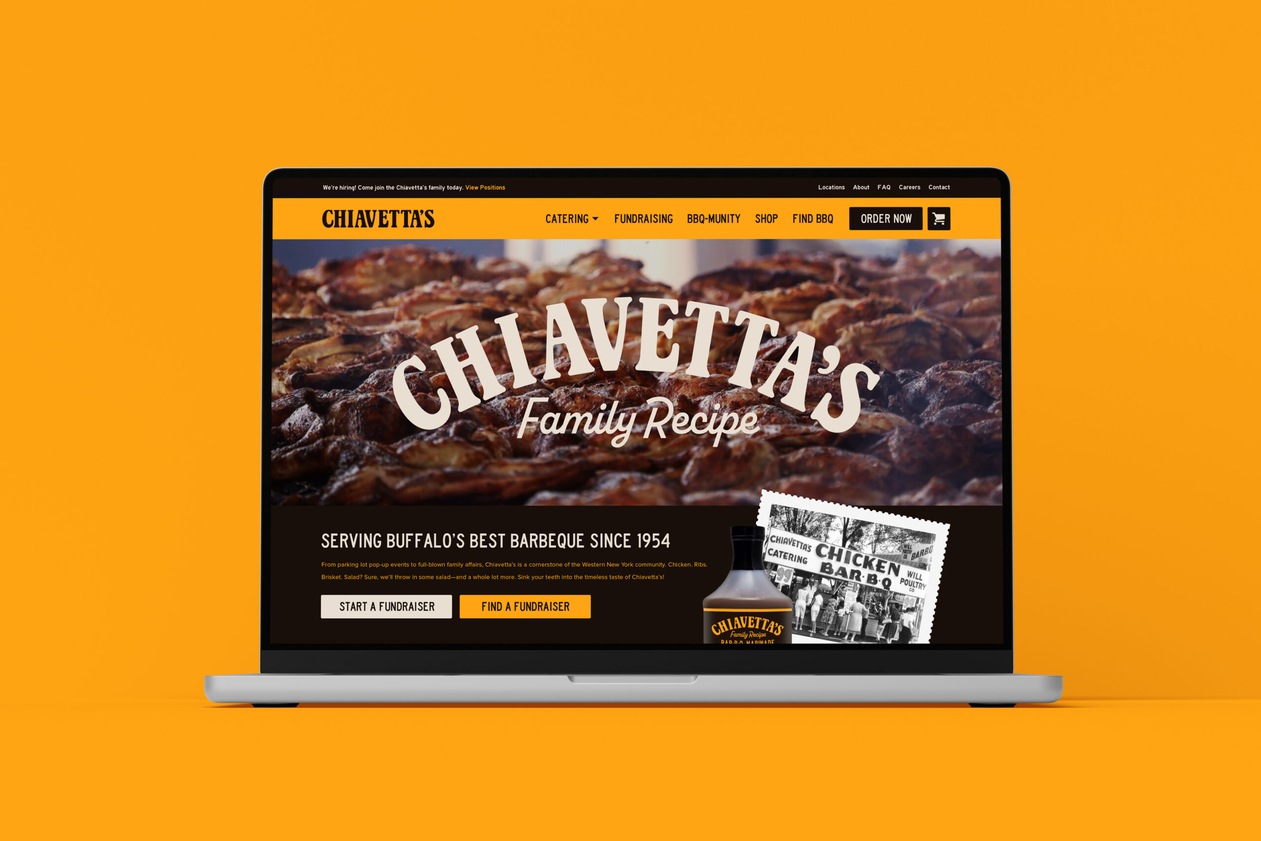
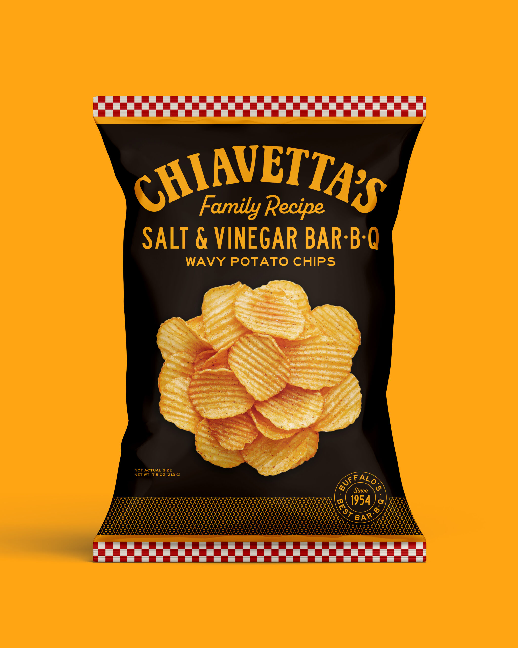
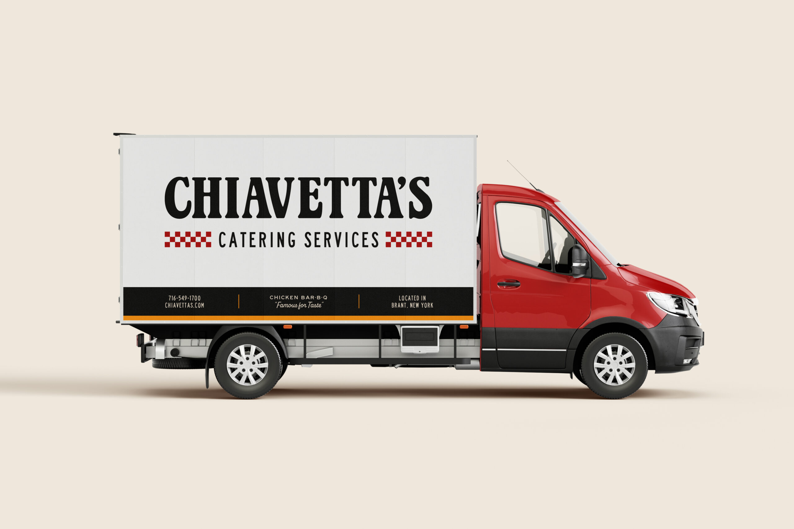
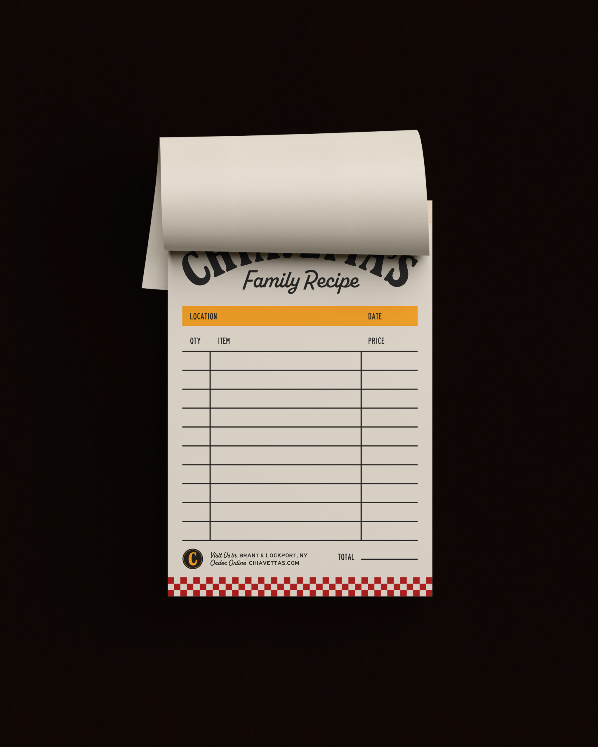
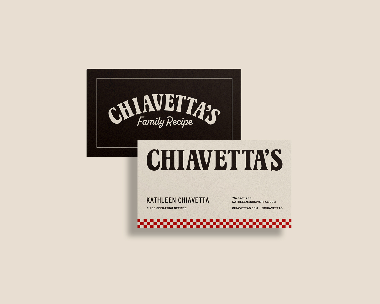
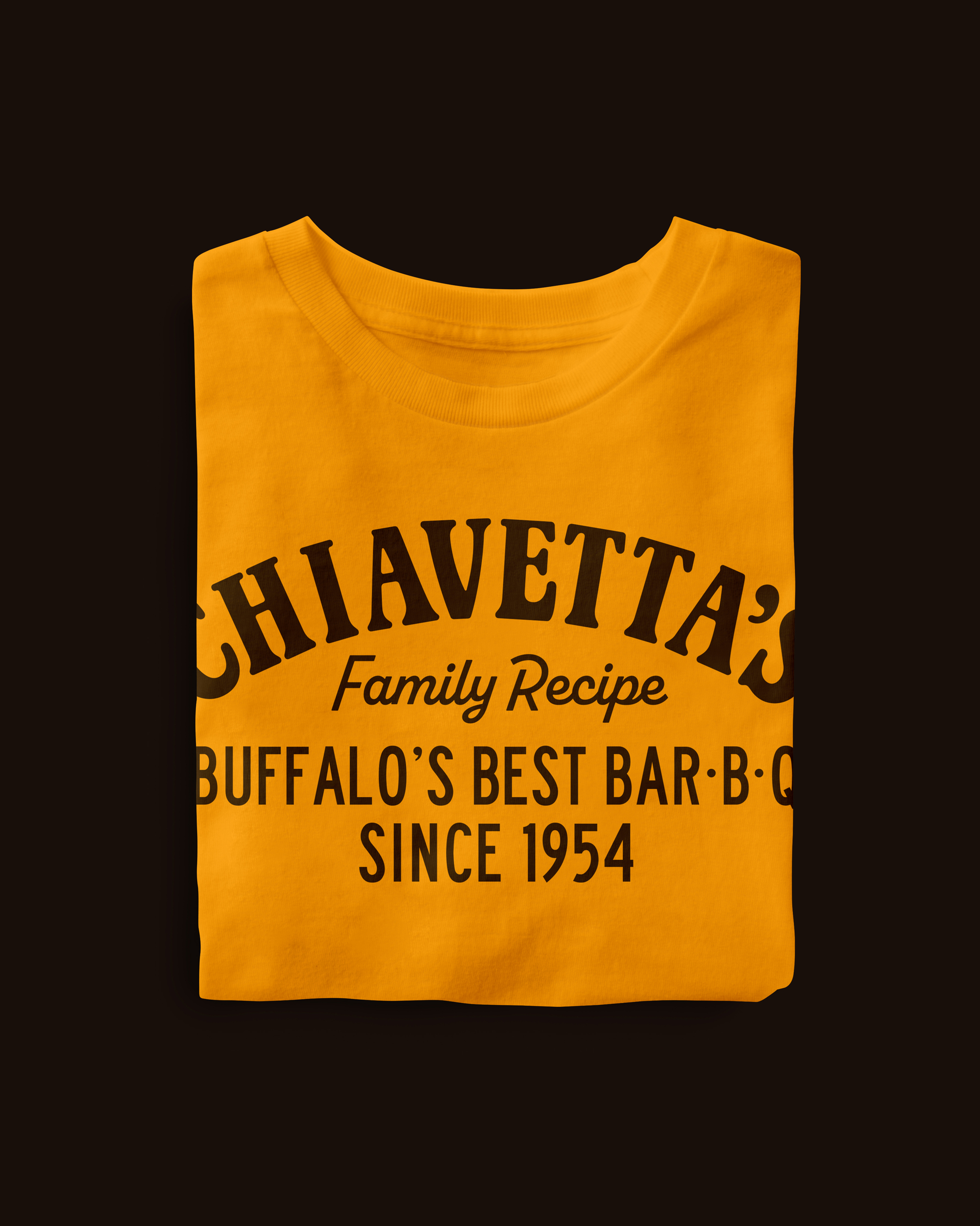
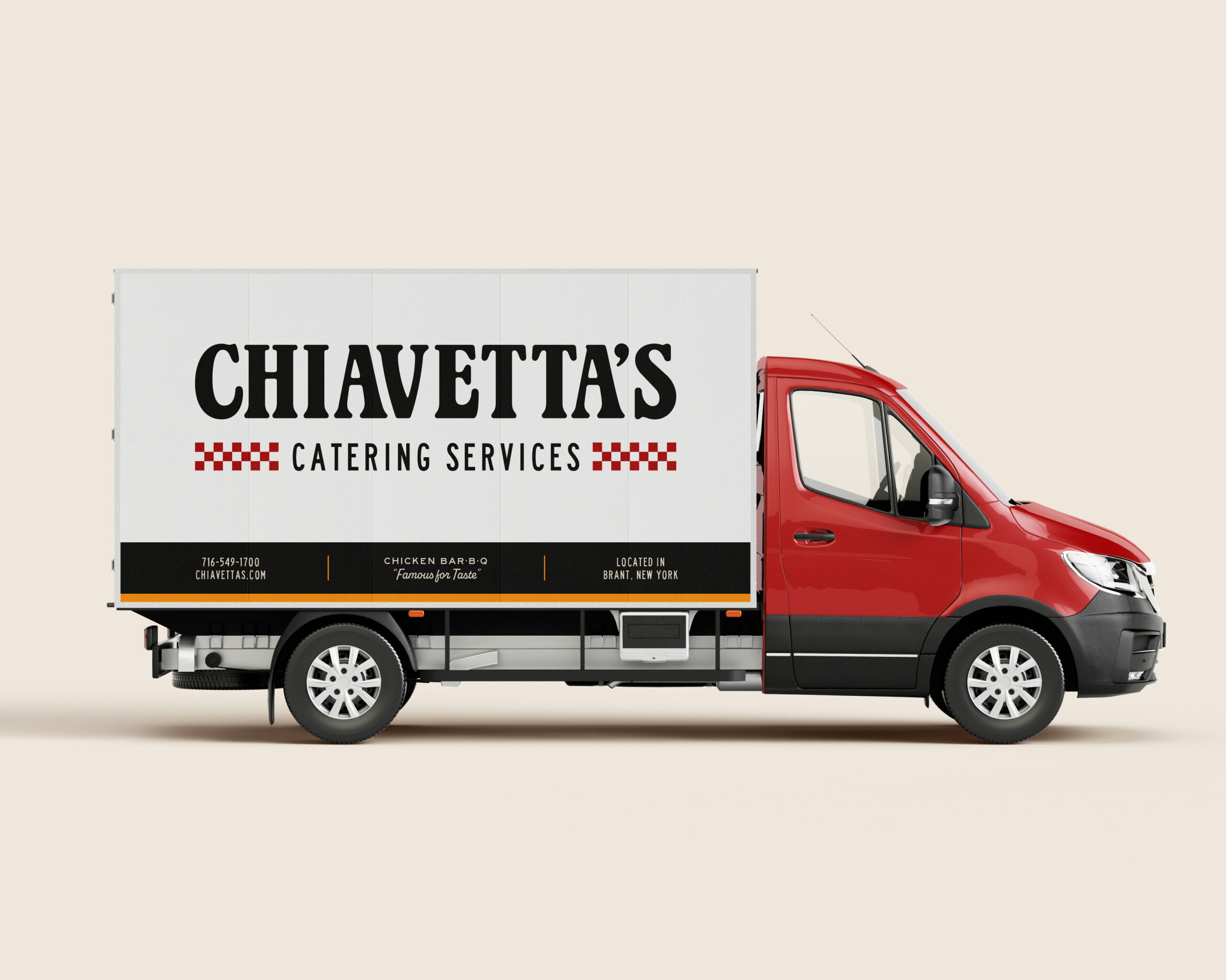
I carried the new identity across a redesigned chip bag, featuring the structure of the marinade bottle, the brand’s red-and-white checker pattern, and a bold hero image of the chips. I also explored how the refreshed identity could extend across a website, catering truck, business cards, promotional posters, employee apparel, and other brand assets.